Location: Kalamata, Greece Services: Naming Concept, Logo Design, Brand Identity, Print & Signage, Social Media Design
The Concept & Philosophy:
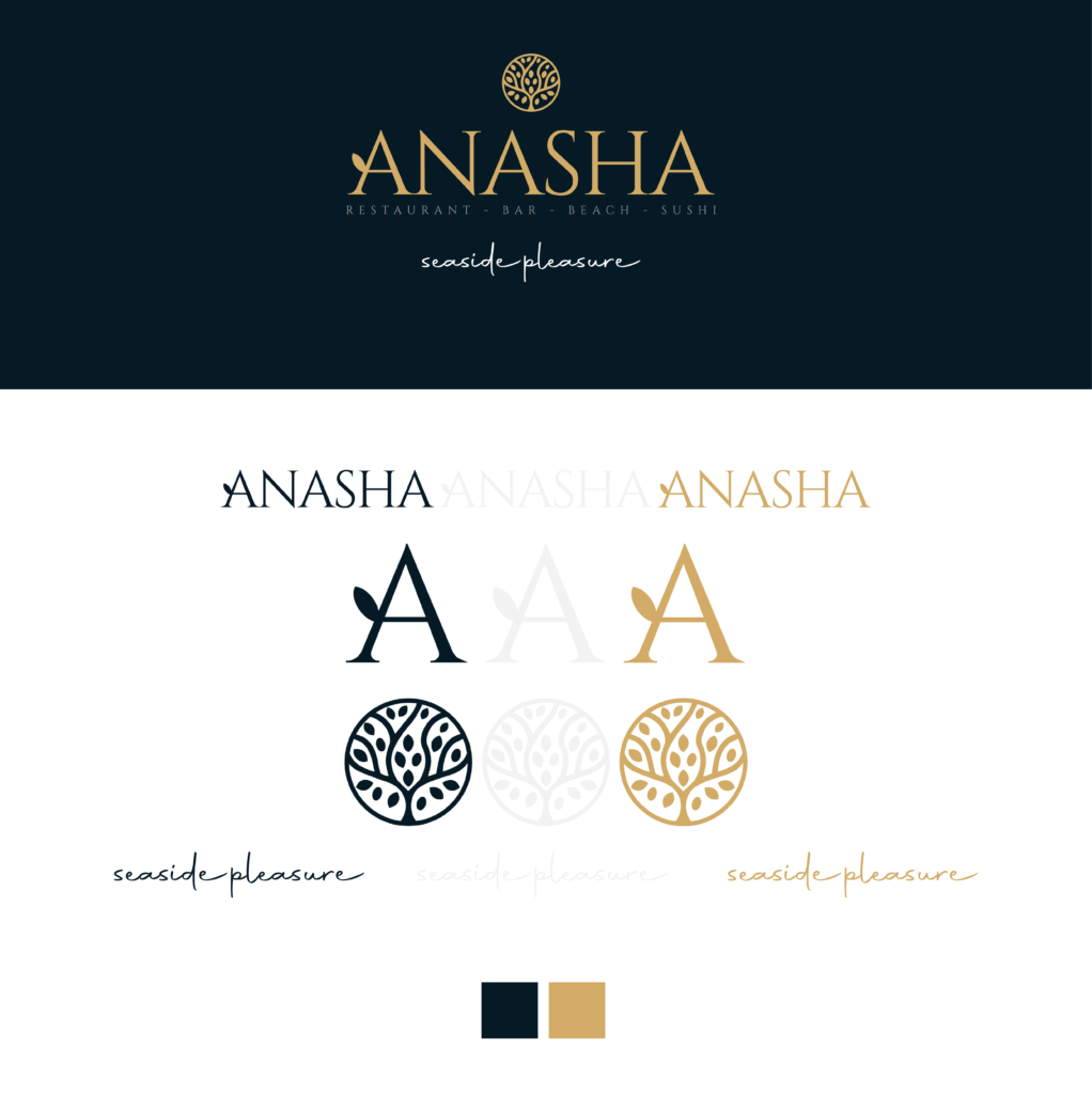
The brand was built upon a name with a powerful, dual essence. On one hand, “ANASHA” is a creative play on the Greek word “ανάσα” (breath). It stands for oxygen, the fresh sea breeze, and ultimate revitalization. Deeply rooted in Kalamata—a city globally renowned for its olive trees—the narrative follows a natural progression: Tree (Olive) > Oxygen > Beach > Breath.
The Design Approach:
This strong conceptual core was brought to life through an elegant logo design. The circular emblem represents a tree, while a delicate leaf detail is seamlessly integrated into the letter “A”.
For the color palette, I selected a sophisticated combination of deep navy blue and gold. The goal was to create a visual identity that bridges the carefree morning relaxation on the beach with the “royal”, refined atmosphere of an evening out. The tagline “seaside pleasure” was rendered in a flowing, handwritten script to evoke the feeling of the ocean breeze.
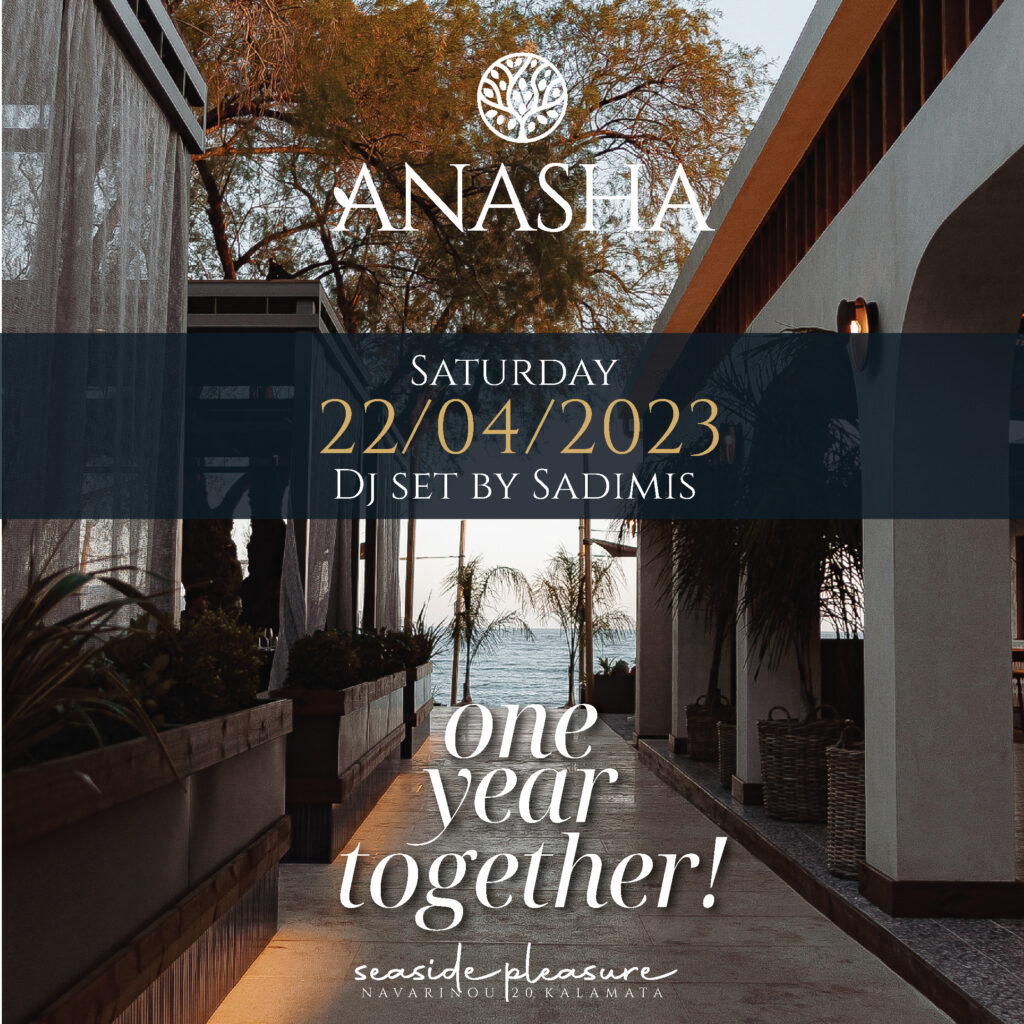
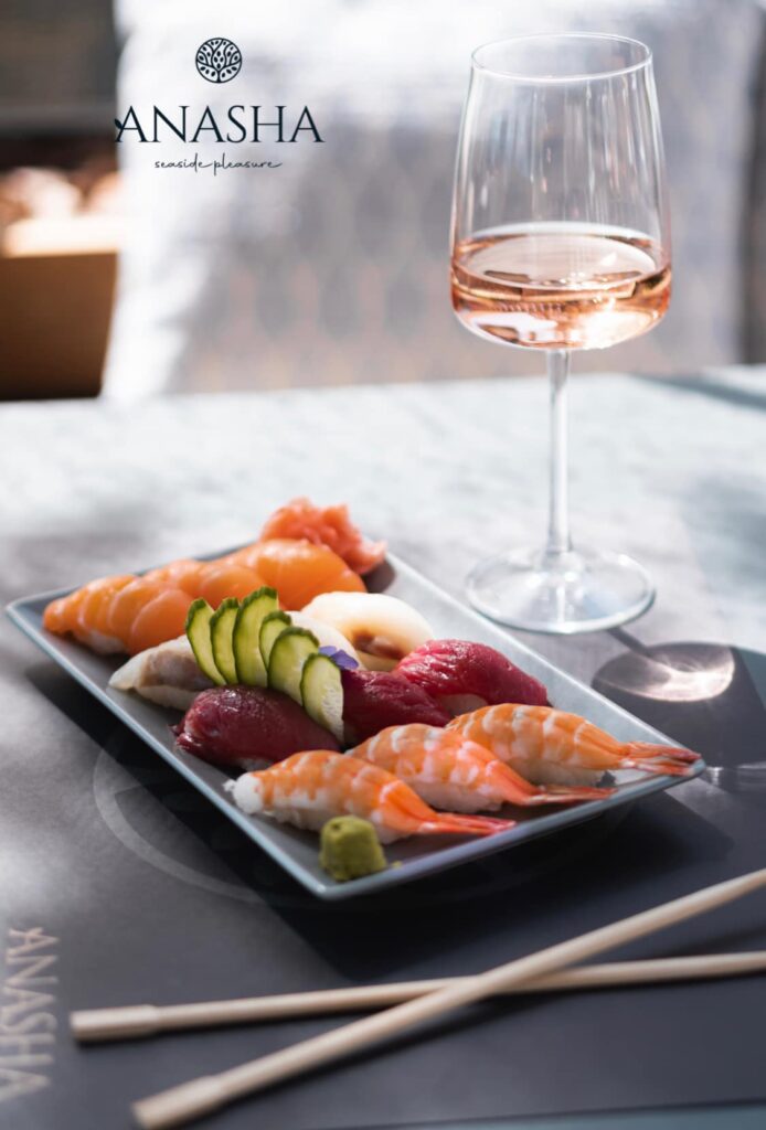
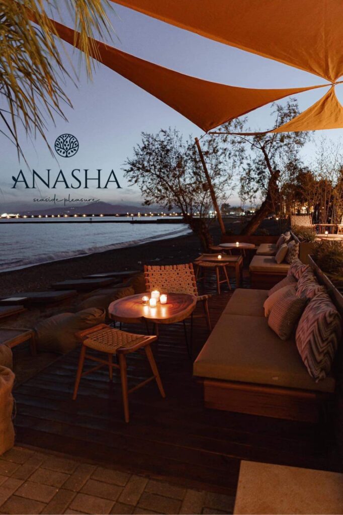
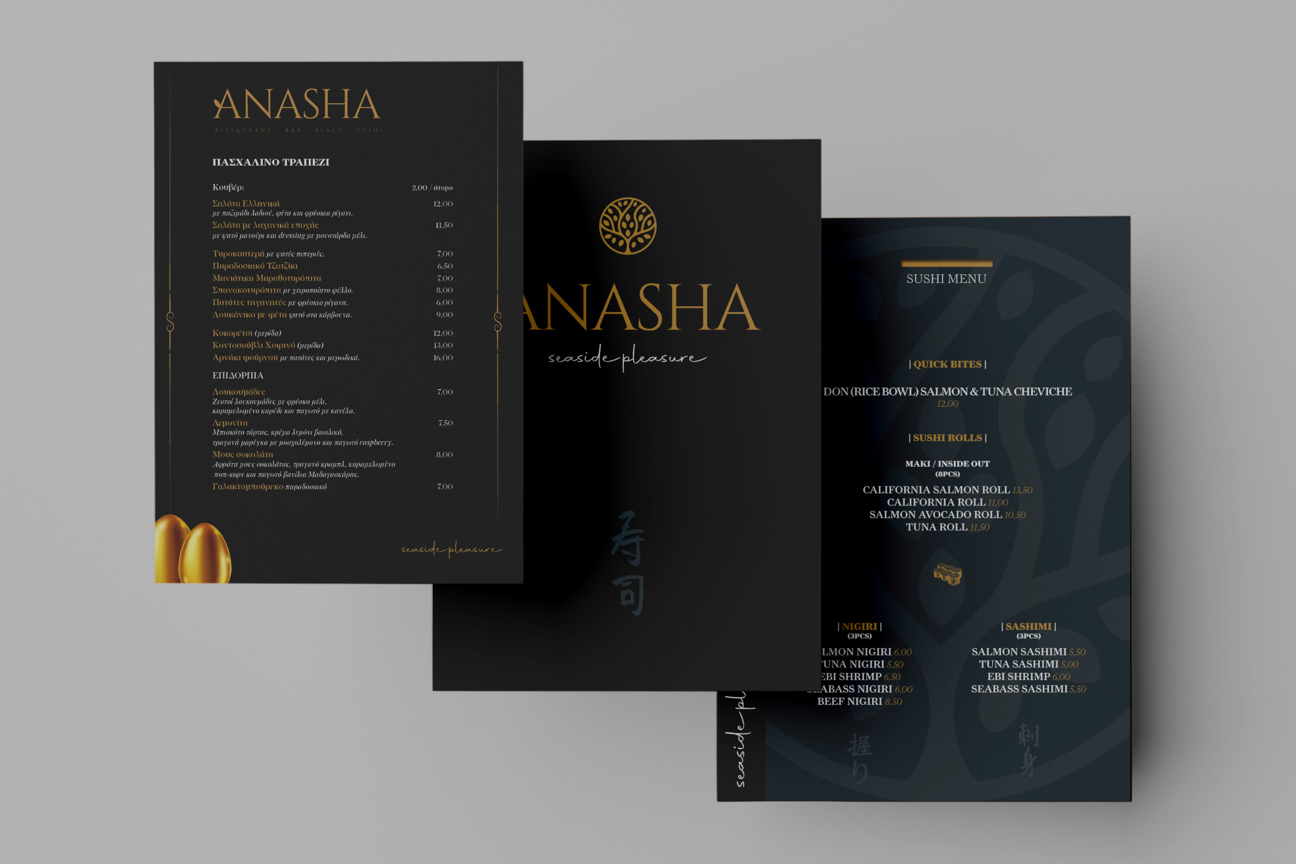
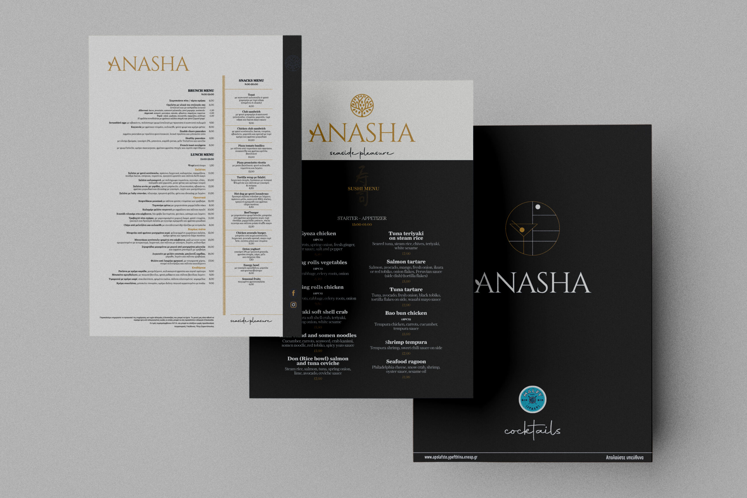
The identity was applied consistently across all touchpoints: from the main signage and minimal print materials (like the sous-plats featuring the subtle tree watermark), to a comprehensive digital ecosystem for Social Media, promoting various events and high-end gastronomy.