Red Pear
Design. Print. Repeat.
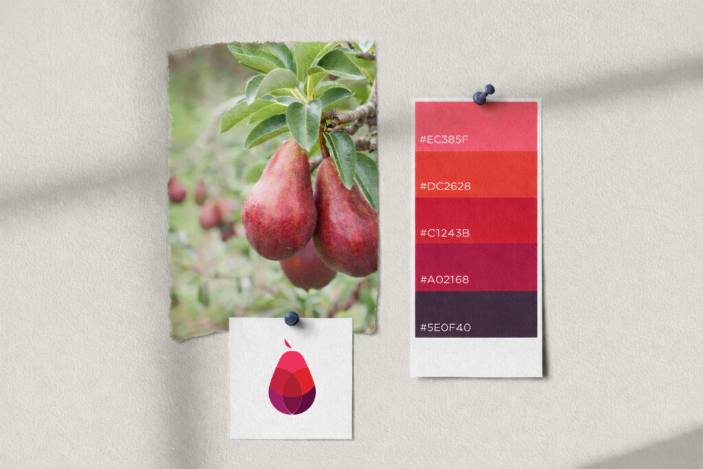
Red Pear is a dynamic company in the graphic arts sector, specializing in comprehensive printing and design services for both print and digital media. As a key creative partner since its inception, I was commissioned to design the company’s corporate identity.
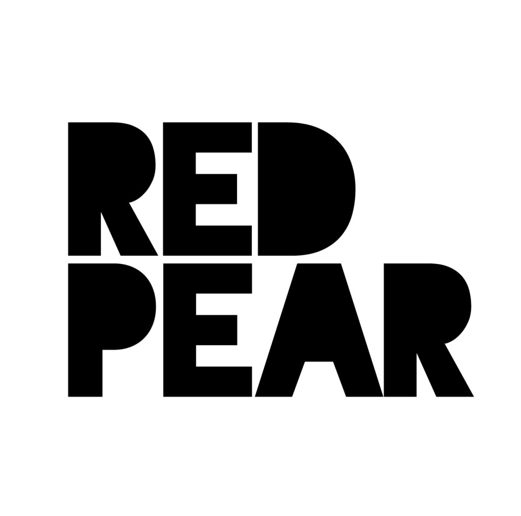
The objective was to create a logo that communicates the core values of the brand: quality, responsiveness, and exceptional service. The design utilizes clean geometric forms to construct the shape of a pear, employing transparency and overlapping effects to symbolize the precision and layering inherent in the printing process. This graphic element is paired with a bold, solid typeface to emphasize the brand’s reliability and professional standing in the market.