Client: Health Code
Project Scope: Logo Design, Label Design, Branding Visuals
Design Concept
The goal was to develop a brand identity for a premium line of wild Greek oregano products that balances pharmaceutical precision with natural purity.
-
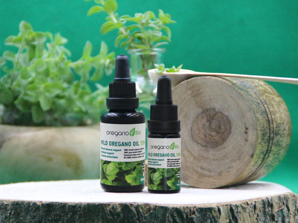
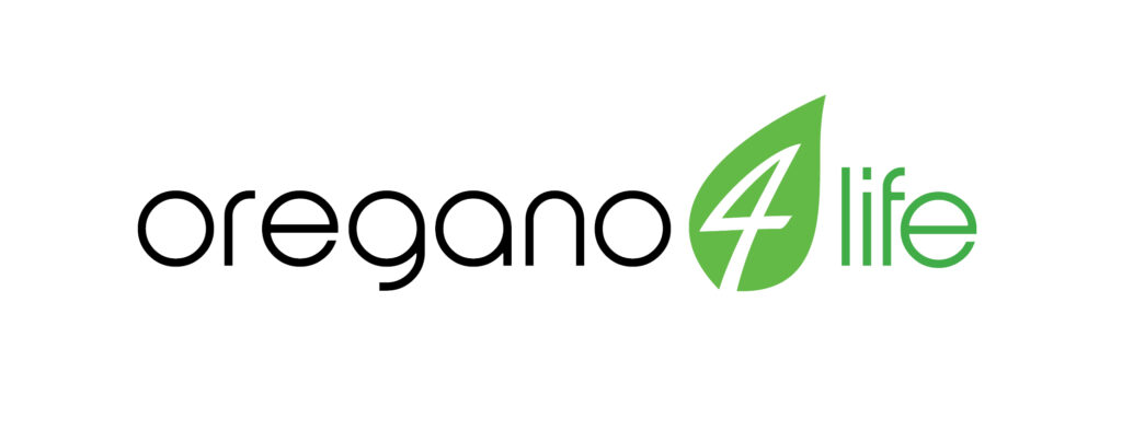
The Logo: A minimalist approach using clean typography. The leaf icon encapsulates the number “4,” creating a powerful symbol for the synergy between nature and life (Oregano 4 Life).
-
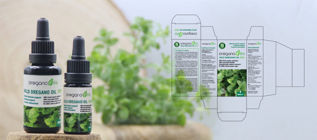
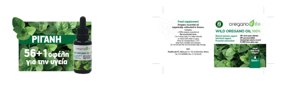
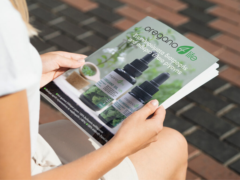
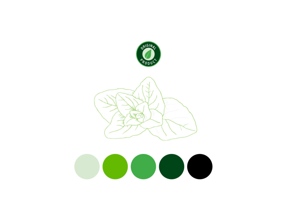
Packaging & Labeling: For the wild oregano oil bottles (10% & 100% concentrations), a high-contrast, clean layout was used. The white background emphasizes the product’s premium quality, while the botanical imagery at the base reinforces its organic origins.